Midas
UI Design
Now that I've waded through the technical 'how' it's time to look at how the user interface is evolving in the game.
There are 3 key pieces of information to show.
- How much sanity does Midas have left?
- How much health does Midas have left?
- How many coins does Midas have?
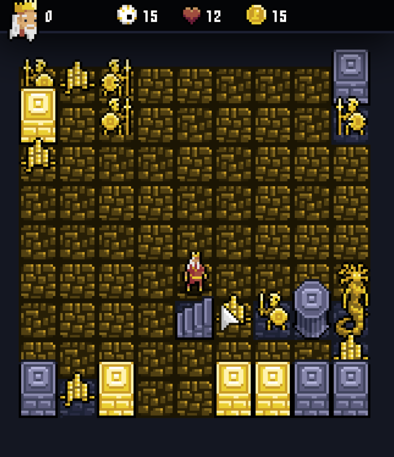
The first version of the UI showed all these stats in a bar at the top of the screen. There are lots of reasons why I scrapped it, but the main one is that both sanity and health are going to have max values and it makes to show that visually as a bar or some kind of graphic that conveys 50% more visually than a label which says "6/12". I'm also not happy with the sanity icon which is supposed to be an eyeball with (golden) bloodshot veins.
I eventually settled on a version with bars for health and kept the coin counter, but moved it into the other corner of the screen.
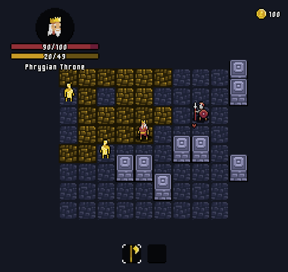
It's not immediately obvious that the second bar is supposed to be sanity and there's not a lot of space for adding explicit labels either. I don't seem to be able to find an obvious icon/symbol that I could use, so I've gone for a slightly different approach with the portrait of Midas' face.
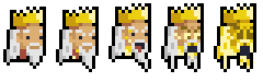
As you lose your sanity, the portrait changes to reflect the different stages of his gold-crazed madness.
I also added the item slots to the bottom of the screen and implemented the foundations for the item system. There's a whole post to come on the role items will play in the game, but probably not any time soon.
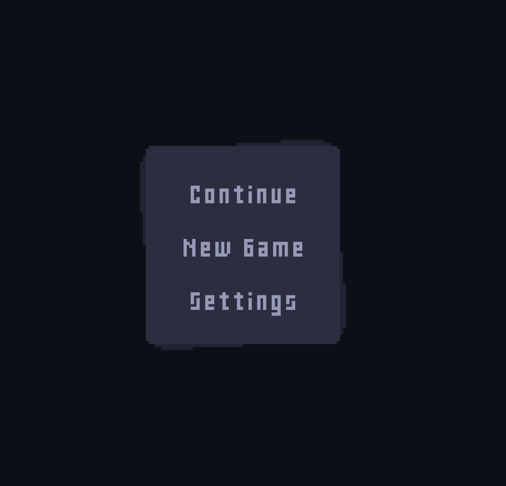
I also worked on two other screens for the game, the first being the main menu. From here you can continue with your most recent game (progress is saved when you close the game), start a new game, or view the settings.
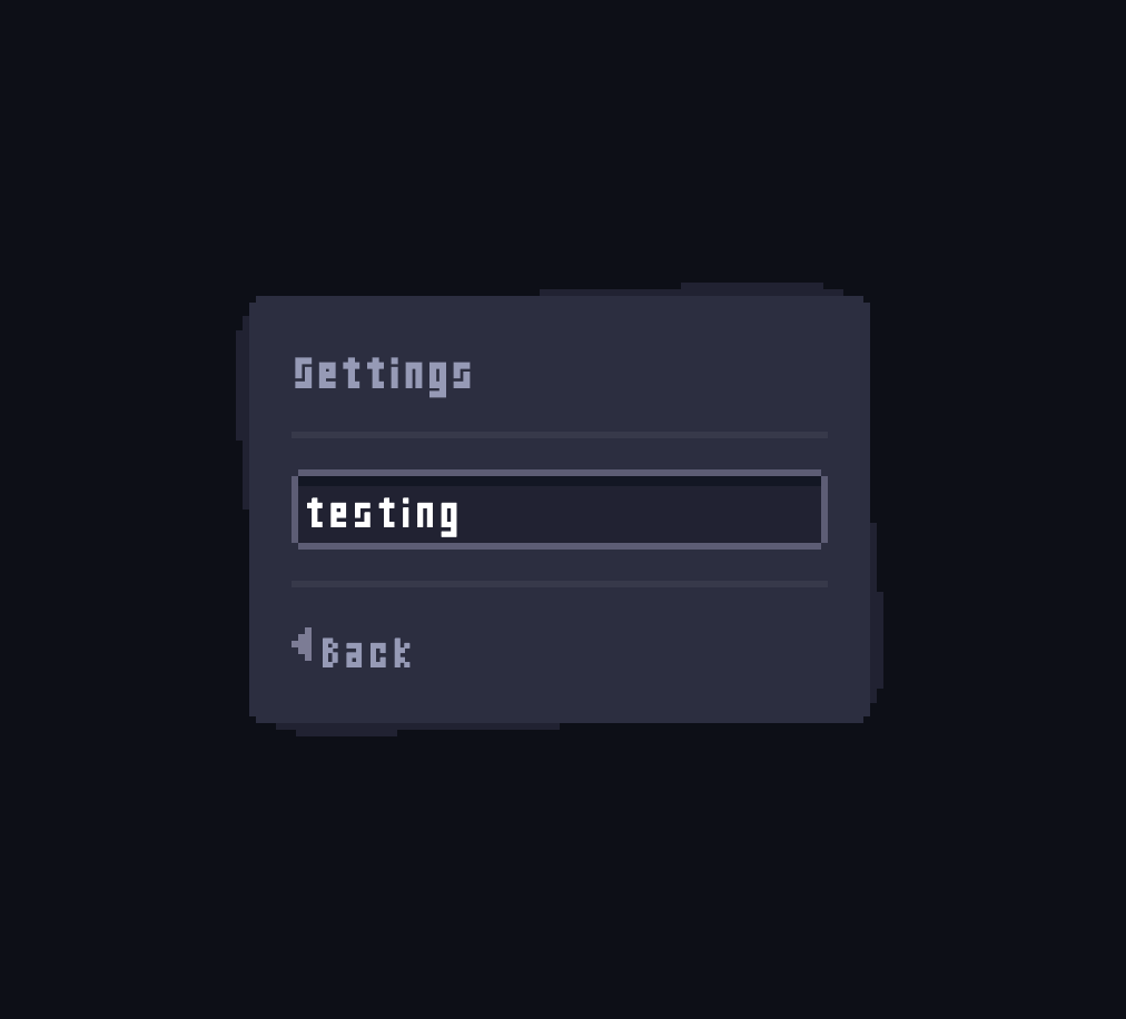
Eventually the settings will control everything from disabling audio and animations, to choosing your own spritesheets, and setting the seed for your next game. Right now it's just an excuse to test out the system I'm using for 9-slice sprites. I don't want the UI to feel like it was styled with CSS, it should feel like an extension of the rendering layer.
Leave a comment
Log in with itch.io to leave a comment.